g <- palmerpenguins::penguins_raw14 Data Visualization in R
14.1 ggplot Package
The ggplot package uses the “grammar of graphics.” With this approach, different layers are added to your visualization allowing for a large degree of customization if you wish. It is also fully possible to just create a simple graph using the defaults.
- Define data (dataframe)
- Choose graph structure (geom)
- Specify variables to use (aesthetics)
- Provide context (titles and labels)
- Make it pretty (themes and colors)
14.2 A Basic Graph
To make a basic graph, we will first read in some data. We will be using the Palmer Peguins dataset again.
Then, we will use that data and feed it to ggplot, using data = g. This is telling ggplot to look at this particular dataframe for all other operations, and allows us to just call variable names to make the desired graph rather than having to define the dataframe as well.
What you will also see in the code below is after we call ggplot and feed it the data we want to use with ggplot(data = g), we add a +, and then add a geom layer. This is specifying the graph structure we want to use. You may only need one, or you may want multiple layers stacked on top of each other.
Some common geom layers are:
- Histogram: geom_histogram
- Bar: geom_bar
- Scatterplot: geom_point
- Line graph: geom_line
- Box plot: geom_boxplot
I encourage you to explore the R-Graph gallery (https://r-graph-gallery.com) for even more options, as well as some beautiful examples of these charts.
In our graph below, we are asking for a histogram with geom_histogram(). We specify which variable we would like the histogram of by specifying which aesthetic (aes()) we want: geom_histogram(aes(Body Mass (g)))
#Call the package
library(ggplot2)

#Make the graph
ggplot(data = g) +
  geom_histogram(aes(`Body Mass (g)`))
`stat_bin()` using `bins = 30`. Pick better value with `binwidth`.Warning: Removed 2 rows containing non-finite outside the scale range
(`stat_bin()`).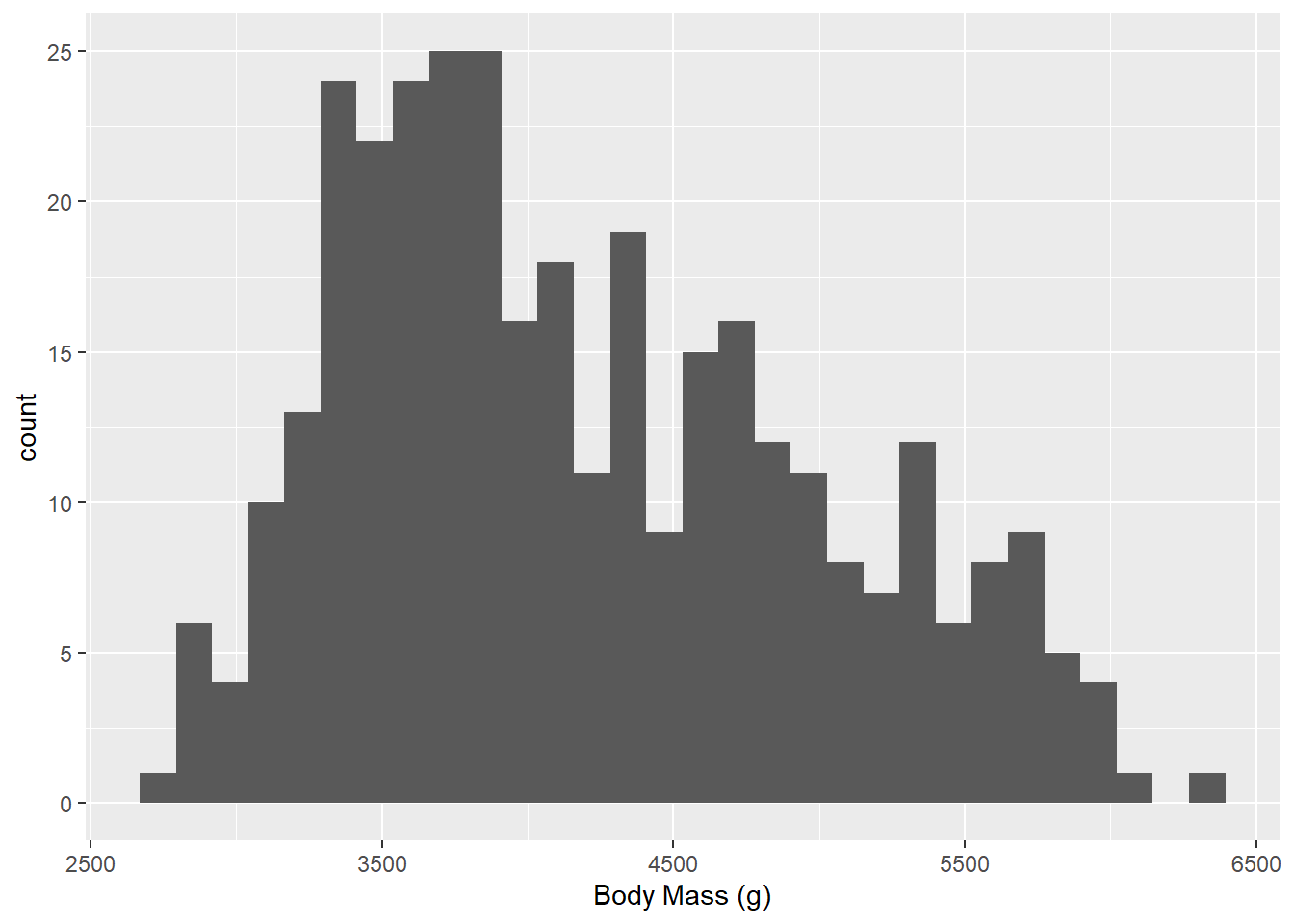
Notice how we had to have our variable name in backticks(`) because they were naughty with their variable names. I am going to rename the variable to use proper variable name conventions so we don’t have to continue to use backticks to refer to that variable.
#Get variable names first
names(g)
[1] "studyName" "Sample Number" "Species"
[4] "Region" "Island" "Stage"
[7] "Individual ID" "Clutch Completion" "Date Egg"
[10] "Culmen Length (mm)" "Culmen Depth (mm)" "Flipper Length (mm)"
[13] "Body Mass (g)" "Sex" "Delta 15 N (o/oo)"
[16] "Delta 13 C (o/oo)" "Comments" #Rename variables to reflect proper conventions
library(tidyverse)Warning: package 'tidyverse' was built under R version 4.2.3Warning: package 'tibble' was built under R version 4.2.3Warning: package 'tidyr' was built under R version 4.2.3Warning: package 'readr' was built under R version 4.2.3Warning: package 'purrr' was built under R version 4.2.3Warning: package 'dplyr' was built under R version 4.2.3Warning: package 'stringr' was built under R version 4.2.3Warning: package 'forcats' was built under R version 4.2.3Warning: package 'lubridate' was built under R version 4.2.3── Attaching core tidyverse packages ──────────────────────── tidyverse 2.0.0 ──
✔ dplyr 1.1.2 ✔ readr 2.1.4
✔ forcats 1.0.0 ✔ stringr 1.5.0
✔ lubridate 1.9.2 ✔ tibble 3.2.1
✔ purrr 1.0.1 ✔ tidyr 1.3.0
── Conflicts ────────────────────────────────────────── tidyverse_conflicts() ──
✖ dplyr::filter() masks stats::filter()
✖ dplyr::lag() masks stats::lag()
ℹ Use the conflicted package (<http://conflicted.r-lib.org/>) to force all conflicts to become errorsg <- g %>%
rename(body_mass_g = `Body Mass (g)`,
sample_number = `Sample Number`,
ID = `Individual ID`,
clutch_completion = `Clutch Completion`,
date_egg = `Date Egg`,
culmen_length_mm = `Culmen Length (mm)`,
culmen_depth_mm = `Culmen Depth (mm)`,
flipper_length_mm = `Flipper Length (mm)`,
delta_15_n = `Delta 15 N (o/oo)`,
delta_13_c = `Delta 13 C (o/oo)`)14.3 Axis Labels
We might not like the built-in axis lables, especially if our variable names are less pretty than the ones in Palmer Penguins. We can make our own axis labels by adding a labs() argument. Here, we are specifying an x axis label.
ggplot(data = g) +
  geom_histogram(aes(body_mass_g)) +
  labs(x = "Body Mass in grams")
`stat_bin()` using `bins = 30`. Pick better value with `binwidth`.Warning: Removed 2 rows containing non-finite outside the scale range
(`stat_bin()`).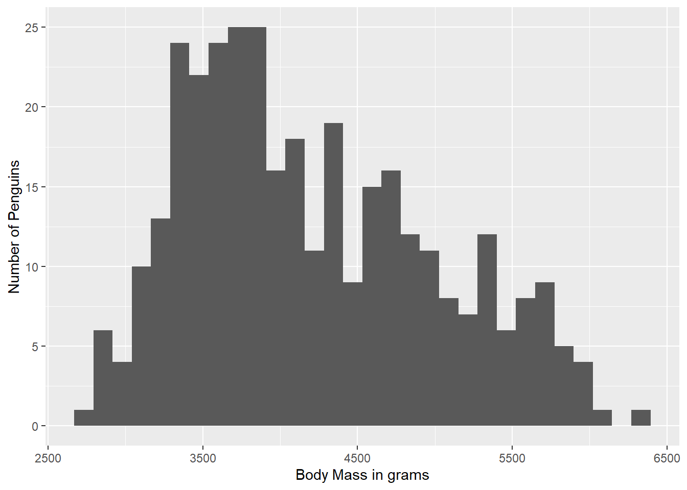
We can also add in a y axis label within the same labs() argument:
ggplot(data = g) +
  geom_histogram(aes(body_mass_g)) +
  labs(x = "Body Mass in grams",
       y = "Number of Penguins")
`stat_bin()` using `bins = 30`. Pick better value with `binwidth`.Warning: Removed 2 rows containing non-finite outside the scale range
(`stat_bin()`).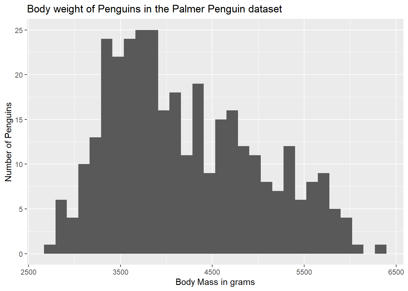
14.4 Adding a Title
The chart title is also contained in the labs() argument, using a title = statement.
ggplot(data = g) +
  geom_histogram(aes(body_mass_g)) +
  labs(x = "Body Mass in grams",
       y = "Number of Penguins",
       title = "Body weight of Penguins in the Palmer Penguin dataset")
`stat_bin()` using `bins = 30`. Pick better value with `binwidth`.Warning: Removed 2 rows containing non-finite outside the scale range
(`stat_bin()`).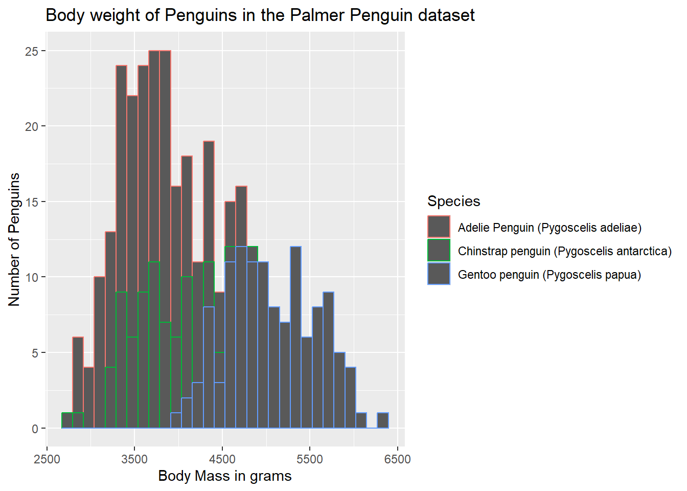
14.5 Color by Group
Thus far, we have just been using the default color (rather ugly grey) provided by ggplot. While this is fine for black and white publications, adding some color would be nice. We can add colored outlines to the bar by adding some extra arguments to our aes() statement. Below, notice how we are now specifying a grouping variable, and a color statement. We are saying, we would like these to be grouped by Species (and that will also trigger the creation of a legend), and we would like different colors for each species.
ggplot(data = g) +
  geom_histogram(aes(x = body_mass_g, group = Species, color = Species)) +
  labs(x = "Body Mass in grams",
       y = "Number of Penguins",
       title = "Body weight of Penguins in the Palmer Penguin dataset")
`stat_bin()` using `bins = 30`. Pick better value with `binwidth`.Warning: Removed 2 rows containing non-finite outside the scale range
(`stat_bin()`).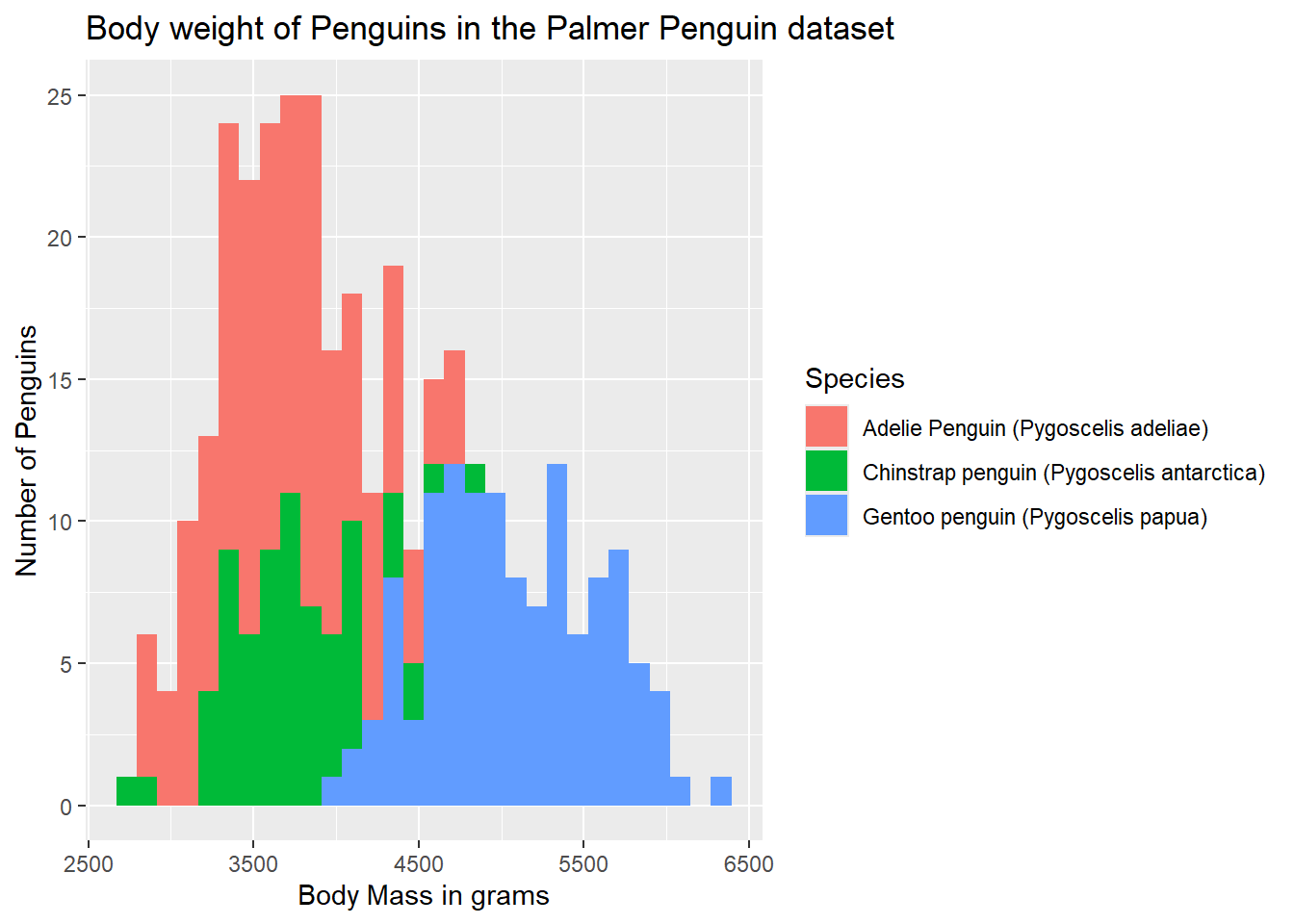
But, the fill is still grey, and the outlines aren’t super clear. Rather than color, we can spefify fill to cause the bars to be filled with color.
ggplot(data = g) +
  geom_histogram(aes(x = body_mass_g, group = Species, fill = Species)) +
  labs(x = "Body Mass in grams",
       y = "Number of Penguins",
       title = "Body weight of Penguins in the Palmer Penguin dataset")
`stat_bin()` using `bins = 30`. Pick better value with `binwidth`.Warning: Removed 2 rows containing non-finite outside the scale range
(`stat_bin()`).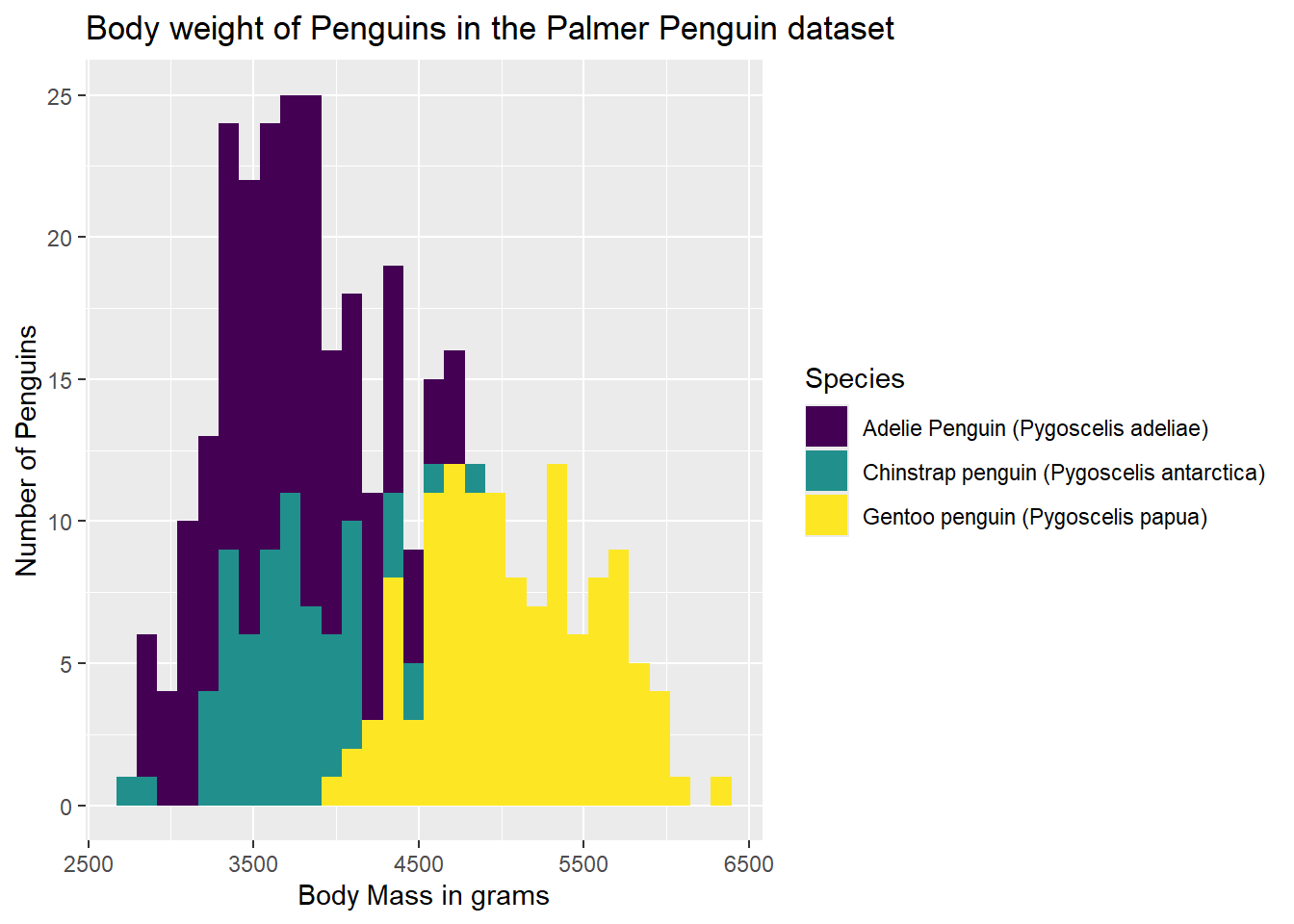
We should also consider accessibility, however. The default colors are not the most accessibile from a number of different perspectives. One color-set that I like to use is the viridis scale (from the self-names viridis package). It is both a color-blind friendly pallette as well as a black-and-white friendly pallette. Since we are using the fill on a categorical variable, we need to add discrete = TRUE to the scale_fill_viridis() argument we added to our plot syntax.
#Call the viridis package
library(viridis)
Warning: package 'viridis' was built under R version 4.2.3Loading required package: viridisLiteWarning: package 'viridisLite' was built under R version 4.2.3ggplot(data = g) +
geom_histogram(aes(x = body_mass_g, group = Species, fill = Species)) +
labs(x = "Body Mass in grams",
y = "Number of Penguins",
title = "Body weight of Penguins in the Palmer Penguin dataset") +
scale_fill_viridis(discrete = TRUE)`stat_bin()` using `bins = 30`. Pick better value with `binwidth`.Warning: Removed 2 rows containing non-finite outside the scale range
(`stat_bin()`).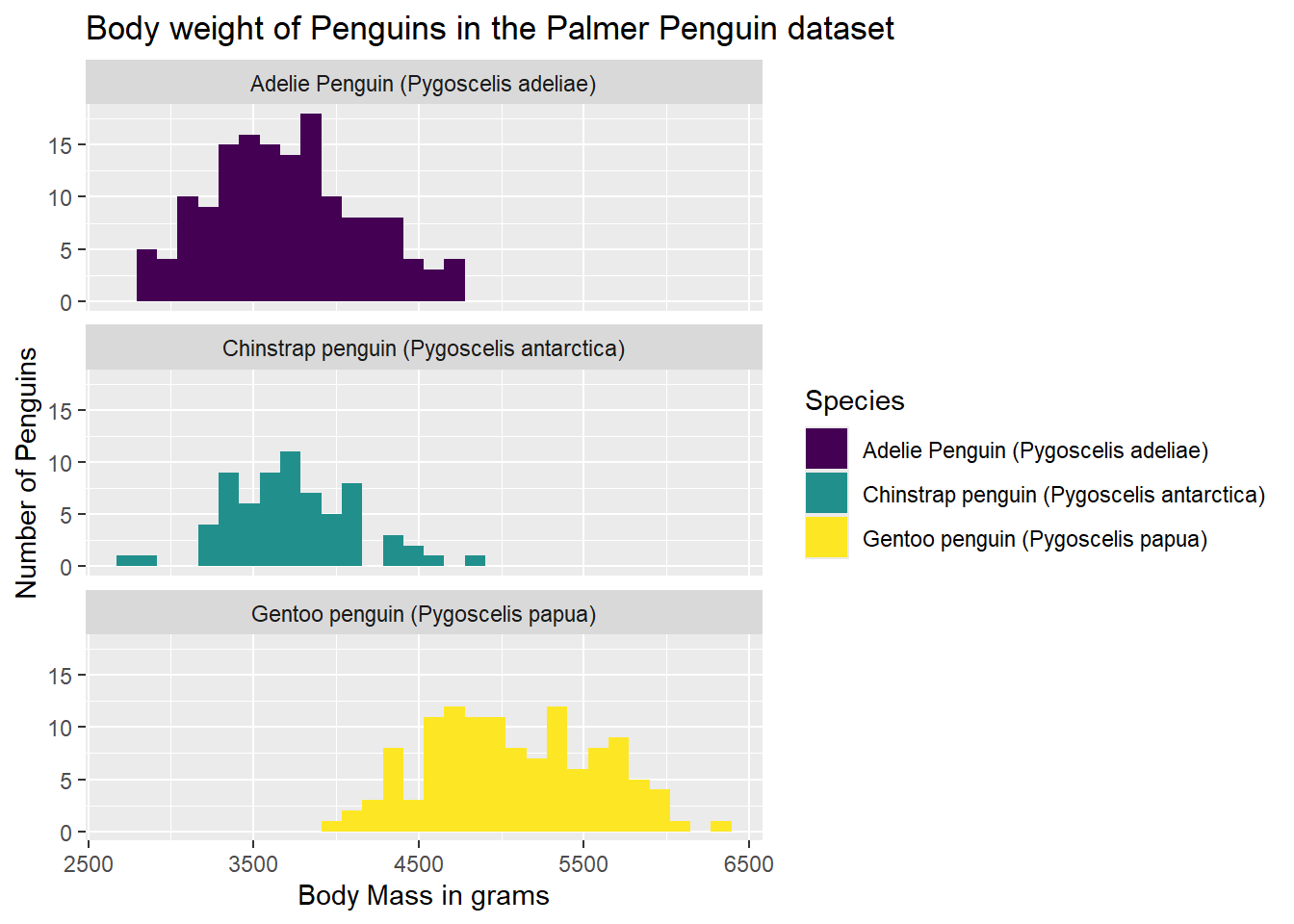
Another way we might like to look at our graph is as three separate graphs, one per group. We can add a facet_wrap() statement to our existing syntax, saying how we want the graphs broken out (~ Species), and if we want them in one column (ncol = 1), or if we’d rather they be in one row (nrow = 1). Below, I have specified a single column.
ggplot(data = g) +
  geom_histogram(aes(x = body_mass_g, fill = Species)) +
  labs(x = "Body Mass in grams",
       y = "Number of Penguins",
       title = "Body weight of Penguins in the Palmer Penguin dataset") +
  facet_wrap(~ Species, ncol = 1) +
  scale_fill_viridis(discrete = TRUE)
`stat_bin()` using `bins = 30`. Pick better value with `binwidth`.Warning: Removed 2 rows containing non-finite outside the scale range
(`stat_bin()`).
14.6 Modifying the Theme
Going back to all one graph for now, we can also change how the background of the graph looks. Perhaps we’d like something other than the grey background with white lines. We can add a theme_minimal() as a built-in theme. This will change the background to white, but keep light grey grid lines.
ggplot(data = g) +
  geom_histogram(aes(x = body_mass_g, fill = Species)) +
  labs(x = "Body Mass in grams",
       y = "Number of Penguins",
       title = "Body weight of Penguins in the Palmer Penguin dataset") +
  scale_fill_viridis(discrete = TRUE) +
  theme_minimal()
`stat_bin()` using `bins = 30`. Pick better value with `binwidth`.Warning: Removed 2 rows containing non-finite outside the scale range
(`stat_bin()`).
14.7 Removing Gridlines
I personally think that gridlines are often distracting, so I remove them. We can add an additional theme() statement to remove the gridlines while keeping our theme_minimal() theme as well.
ggplot(data = g) +
  geom_histogram(aes(x = body_mass_g, fill = Species)) +
  labs(x = "Body Mass in grams",
       y = "Number of Penguins",
       title = "Body weight of Penguins in the Palmer Penguin dataset") +
  scale_fill_viridis(discrete = TRUE) +
  theme_minimal() +
  theme(panel.grid = element_blank())
`stat_bin()` using `bins = 30`. Pick better value with `binwidth`.Warning: Removed 2 rows containing non-finite outside the scale range
(`stat_bin()`).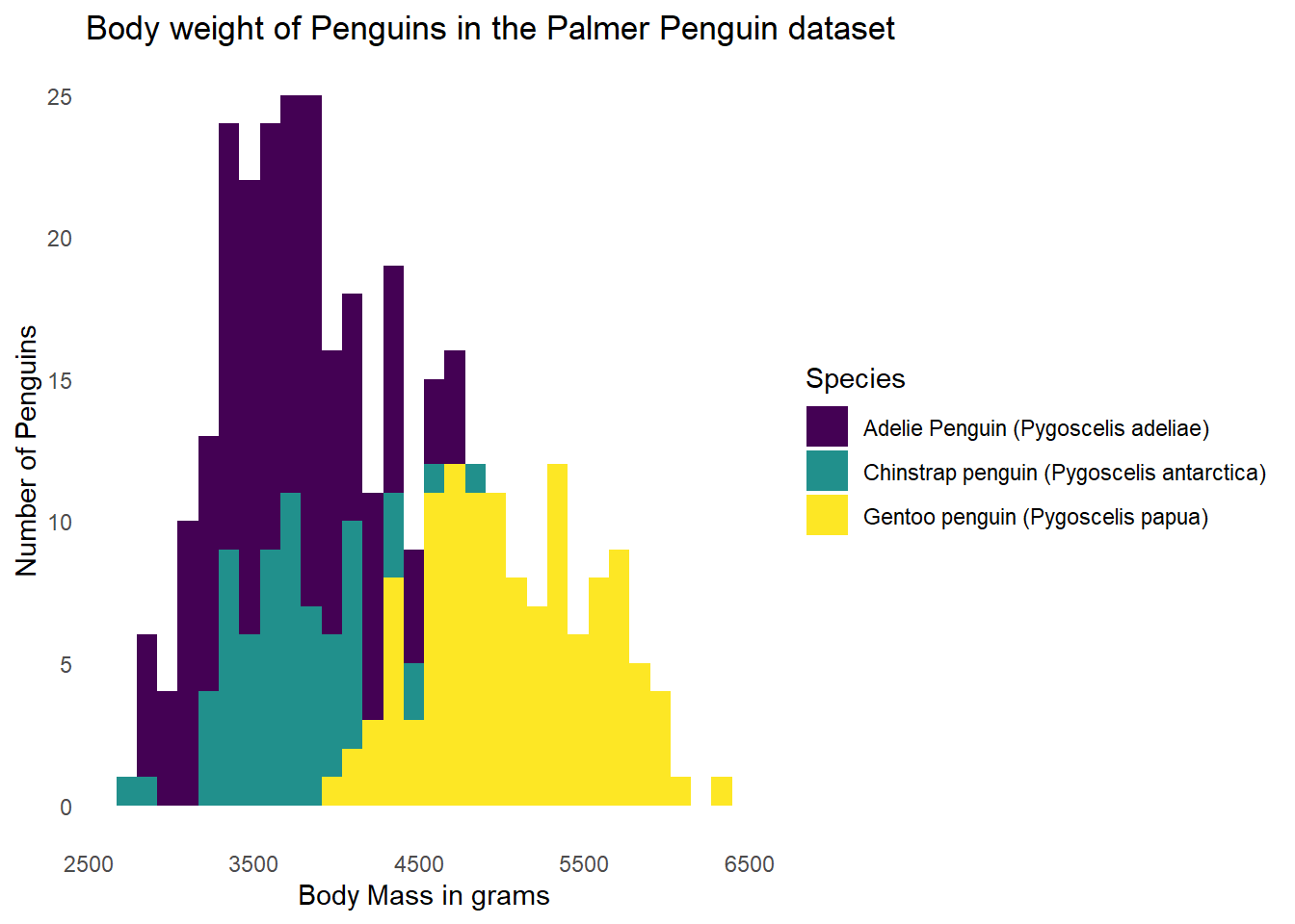
14.8 Going to a Different Graph
Below, I am simulating some data to illustrate another type of graph, and how multiple different geom layers can be used in the same graph.
#Simulate some data
num_groups <- 4
num_points <- 20

df_shape <- data.frame(
  time = rep(1:num_points, num_groups),
  value = rep(seq(10, 50, length.out = num_points), num_groups) +
          rnorm(num_points * num_groups, mean = 0, sd = 3),
  group = factor(rep(1:num_groups, each = num_points))
)
We will start with a geom_line() layer, indicating we would like a line graph. We are also grouping by “group”, starting with a minimal theme and no gridlines, and using the viridis color scale.
#Plot the data
ggplot(df_shape, aes(x = time, y = value, color = group, group = group)) +
  geom_line() +
  scale_color_viridis(discrete = TRUE) +
  theme_minimal() +
  theme(panel.grid = element_blank())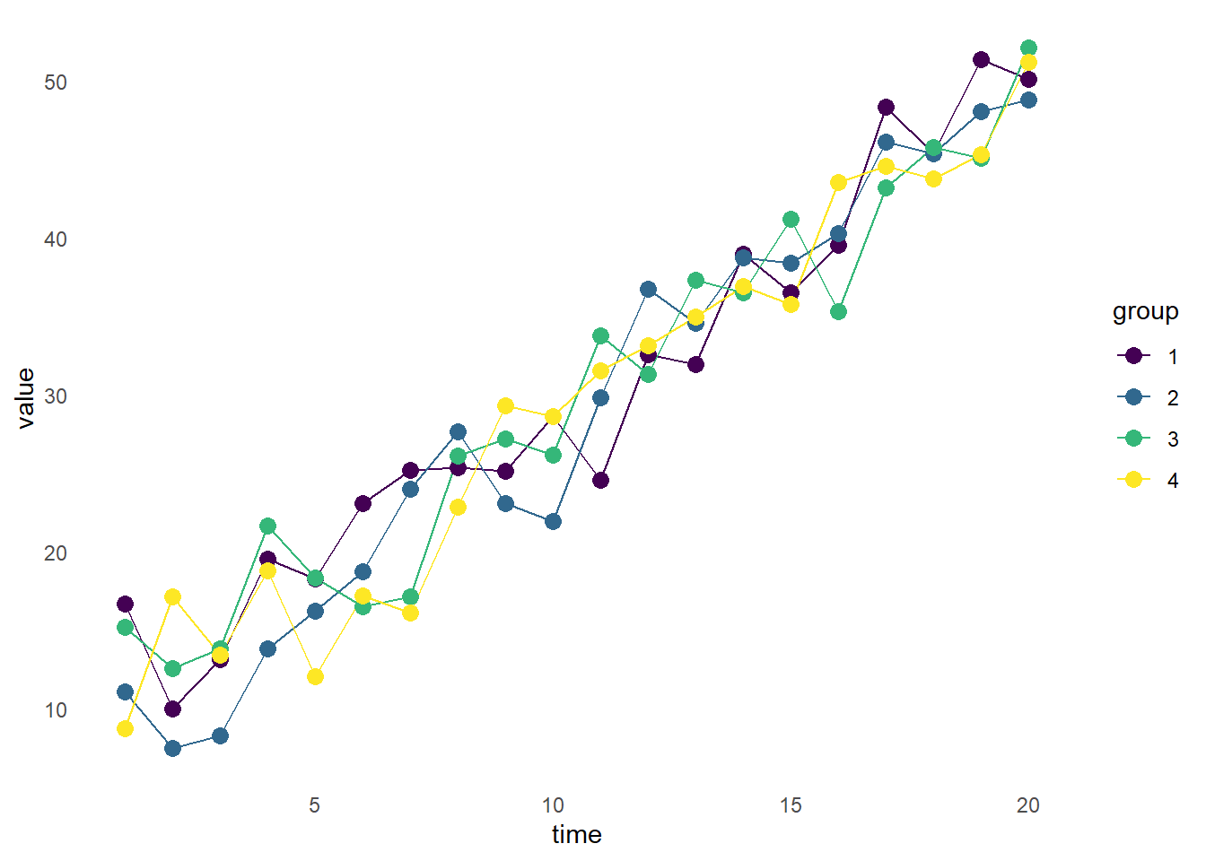
14.9 Multiple Layers
The graph above is fine, but maybe we’d also like the data points plotted. We can add a second geom layer, geom_point() to accomplish this.
ggplot(df_shape, aes(x = time, y = value, color = group, group = group)) +
  geom_line() +
  geom_point(size = 3) +
  scale_color_viridis(discrete = TRUE) +
  theme_minimal() +
  theme(panel.grid = element_blank())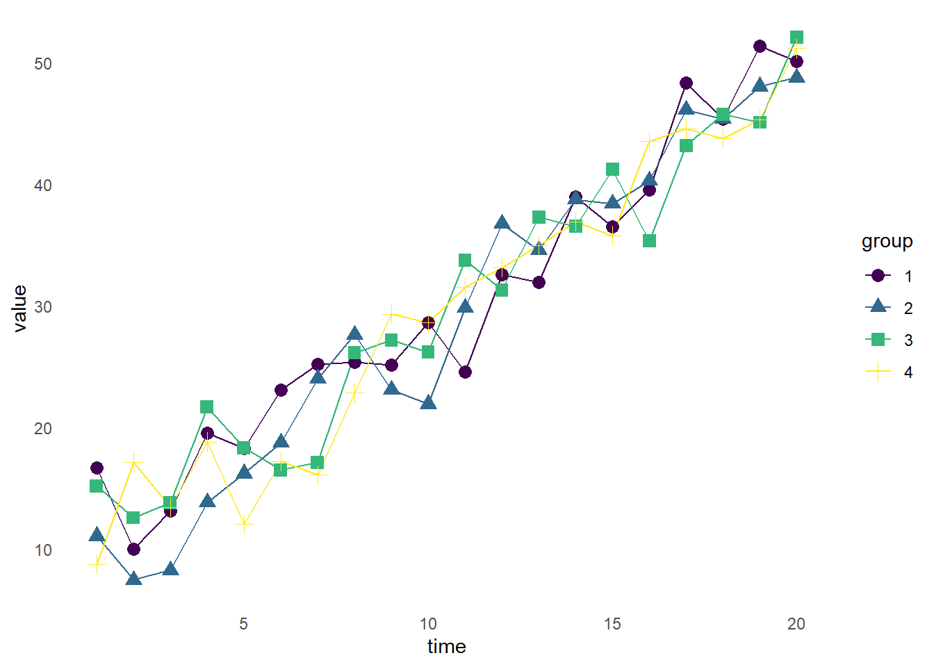
Now, we have each of the data points plotted with a point, while retaining the connecting lines.
14.10 Adding Shapes
With geom_point(), we can change the shape and size of the dots. To do this, we will add an aes() argument to the geom_point() (but not geom_line()) layer, indicating we’d like different shapes by group, and a size 3 point. ggplot will select the points for us, and indicate them along with color in the legend.
ggplot(df_shape, aes(x = time, y = value, color = group, group = group)) +
  geom_line() +
  geom_point(aes(shape = group), size = 3) +
  scale_color_viridis(discrete = TRUE) +
  theme_minimal() +
  theme(panel.grid = element_blank())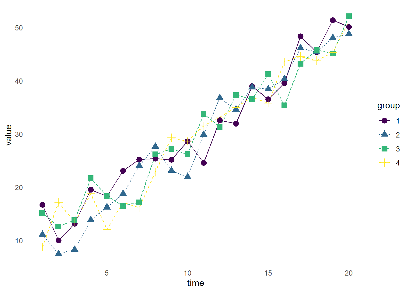
14.11 Line Types
We can also change line types (i.e., solid, dashed, dash-dot, etc.) of our line graph by adding an aes() argument to the geom_line() layer specifying we want different line types by group (linetype = group).
ggplot(df_shape, aes(x = time, y = value, color = group, group = group)) +
  geom_line(aes(linetype = group)) +
  geom_point(aes(shape = group), size = 3) +
  scale_color_viridis(discrete = TRUE) +
  theme_minimal() +
  theme(panel.grid = element_blank())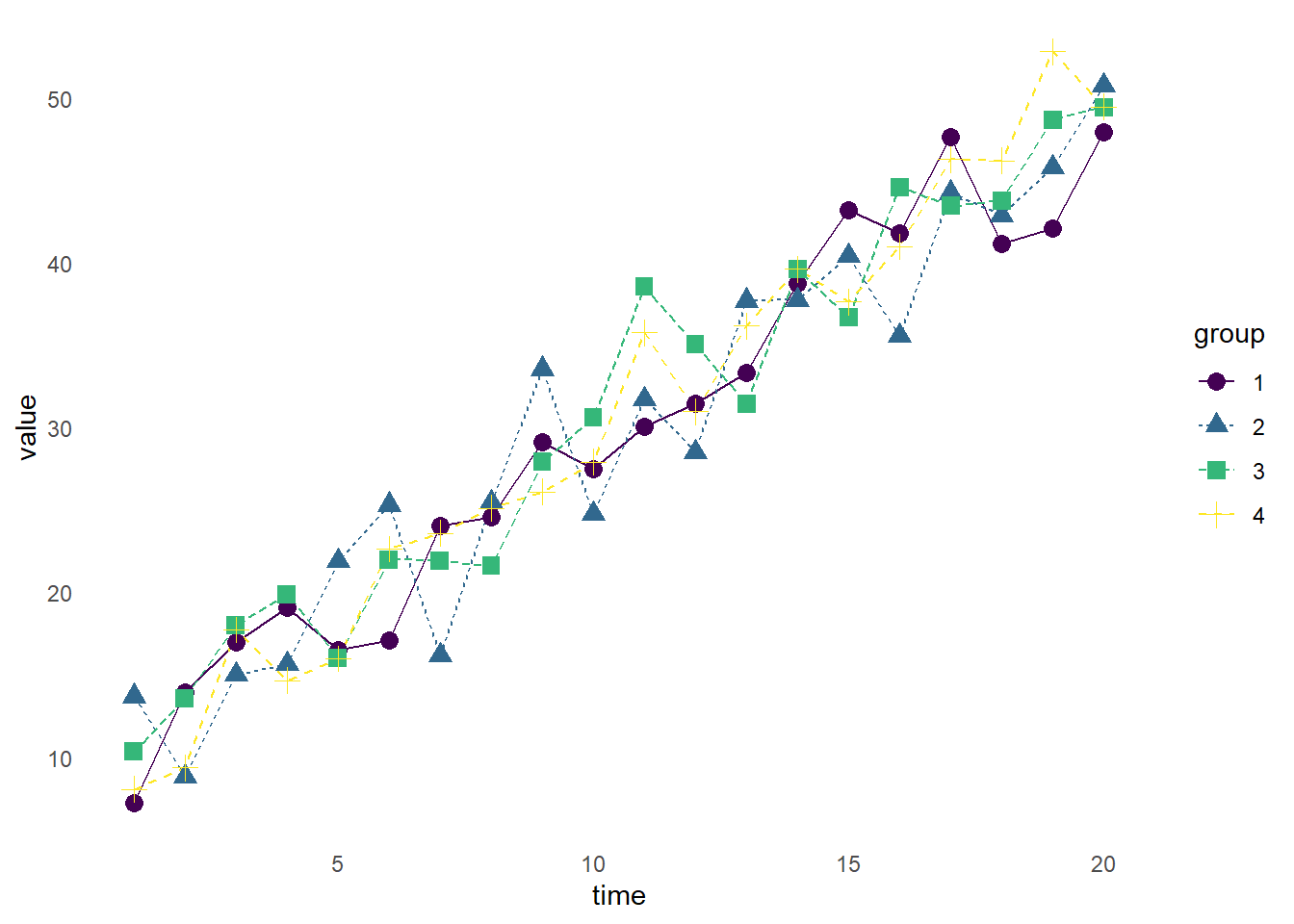
There are MANY more graphs, and options, than I have discussed here. I strongly encourage you to spend some time in the R graph gallery to see how different layers can create different visualizaions.